Theo Chocolate Packaging:
Collaborators: Solo
Timeframe: 8 weeks
Tools: Procreate, Illustrator, Photoshop, Figma
Role: Brand Identity, Packaging Design, Illustration, Layout, Research
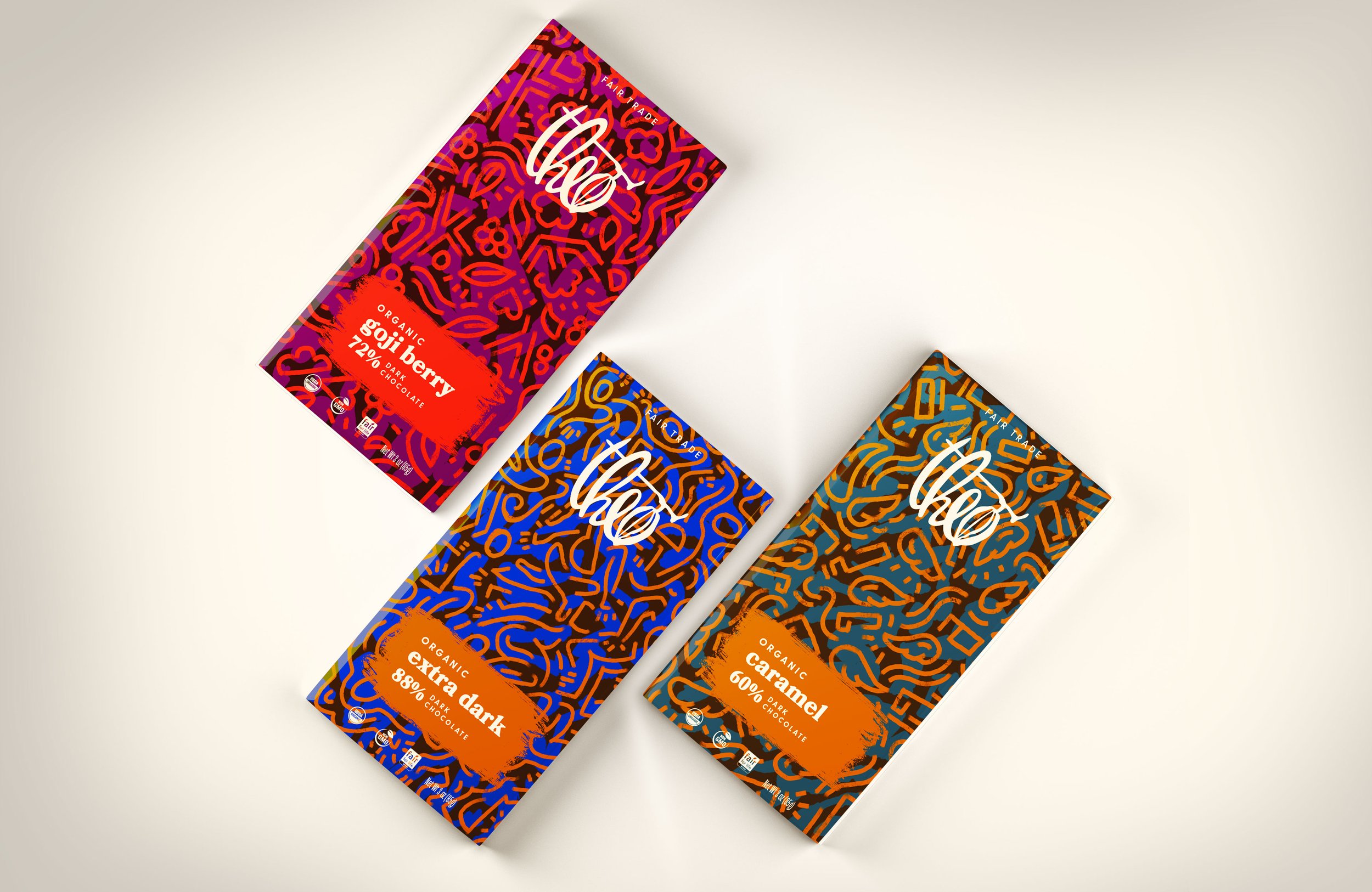
Overview: This brand expansion for Theo Chocolate packaging builds upon the parent brand’s design foundation while exploring a new energetic territory that expresses the joy of chocolate.
Problem: The brand of Theo has an elegant and recognizable design system across a variety of chocolate products. At the same time, it is important for a brand to be able to grow and expand as new products are introduced. This led to the question of how might we design a new series of chocolate bars that both family within the parent brand while differentiating in a new visual tone?
Solution: This new series of Theo bars explore the exciting, celebratory, and complex experience of dark chocolate. The abstract and dynamic line quality of the patterns display a cheerful movement that reference the delight of rich flavors. The packaging families within the parent brand by its use of typography and graphic elements so they are instantly recognized as Theo chocolate.

PACKAGING
GOJI BERRY FRONT & BACK
EXTRA DARK FRONT & BACK
CARAMEL FRONT & BACK